Netflix vs IMDb Ratings
A static Tableau visualization exploring IMDb ratings, viewer age categories, and content length trends in Netflix releases.
OVERVIEW
This project presents a static visualization designed in Tableau, analyzing how Netflix content compares with IMDb ratings across genres, age categories, and average durations. It includes a bar chart of top-rated titles, a radial chart for age distribution, and a line chart showing shifts in average duration by content type. The layout prioritizes storytelling over interactivity, with a clear narrative supported by well-chosen visual elements.
KEY FEATURES & IMPLEMENTATION
• Static multi-chart layout designed in Tableau
• Data preparation handled in Excel for consistency
• Clear and minimal visual elements to support visual storytelling
• Unified Netflix-themed color palette and branding across all charts
TECHNOLOGIES USED
Tableau, Excel, Visual Design
CHALLENGES
• Balancing visual richness with layout clarity
• Avoiding bias from unrated content (2,282 rows excluded)
• Using static visual elements to communicate multi-dimensional data
LEARNINGS & IMPACT
This project emphasized how visual design and thematic clarity can enhance the communication of data. It reinforced the power of layout and color in guiding user attention, especially in a non-interactive context like static presentations.
SCREENSHOTS
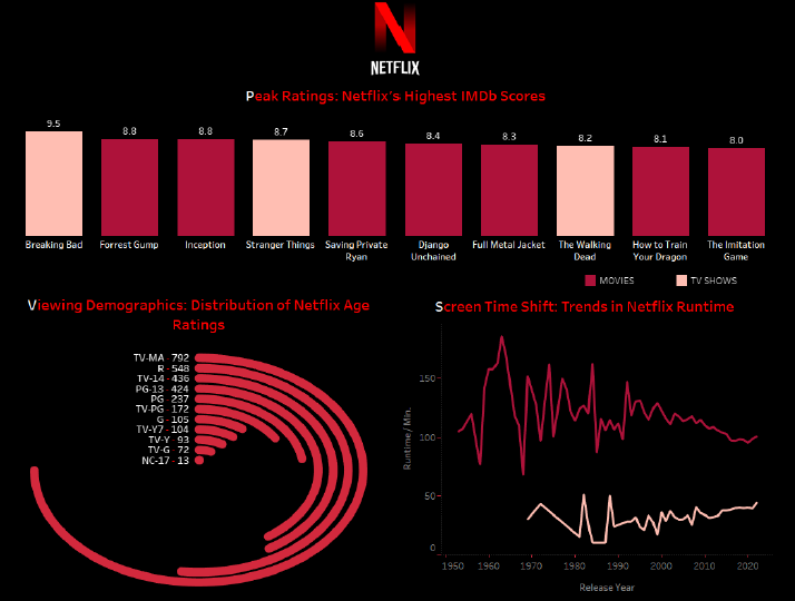
Figure 1. A static Tableau visualization combining a bar chart of IMDb-rated Netflix titles, a radial distribution of age ratings, and a line chart showing how content length has evolved across release years.